Article
The Art and Science of Color Themes in Modern Web Design
Author: Agus Budi Harto, 2026-01-17 11:58:07
Color is the silent language of the web. It speaks before words are read, before images are processed, and before interactions begin. For web designers in 2025 and beyond, understanding color themes isn't just about making websites look beautiful—it's about crafting experiences that resonate emotionally, communicate effectively, and serve users across diverse contexts and preferences. The landscape of web color design has evolved dramatically, shaped by technological advances, accessibility awareness, and shifting aesthetic sensibilities that demand both creativity and strategic thinking.
The Infinite Palette: Understanding Color Possibilities
When we talk about colors in web design, we're working within a paradox of limitation and abundance. The human eye can distinguish approximately ten million different colors, yet our digital displays render colors through the RGB color space, which technically offers over 16 million possible combinations. Despite this overwhelming abundance, effective web design rarely employs more than five to seven colors in a single theme. This restraint isn't a limitation but rather a design principle rooted in cognitive psychology and visual harmony. The most successful websites understand that color isn't about quantity but about purposeful selection and masterful application.
The concept of color themes in web design extends far beyond simply picking attractive hues. A color theme is a complete system that encompasses primary brand colors, secondary supporting colors, accent colors for calls-to-action, neutral tones for backgrounds and text, and semantic colors that communicate status or feedback. Each color within this system must work harmoniously with the others while serving specific functional and emotional purposes. Modern web designers don't just choose colors; they orchestrate them into cohesive visual symphonies that guide users through digital experiences with intuitive clarity.
The Contrast Conundrum: Balancing Beauty and Function
The relationship between color contrast and visual appeal represents one of web design's most fascinating challenges. Contrast is the invisible scaffolding that holds design together, creating hierarchy, establishing focus, and ensuring readability. Yet contrast's role in beauty is far more complex than simply cranking up the difference between light and dark. High contrast can certainly create striking, bold aesthetics that command attention and convey energy, but it can also feel harsh or aggressive when overused. Conversely, low contrast designs can evoke sophistication, calmness, and elegance, though they risk sacrificing readability and accessibility when taken too far.
Contemporary web design has learned to navigate this tension through strategic variation. The most beautiful modern websites employ what might be called "contrast choreography," varying contrast levels throughout the page to create rhythm and visual breathing room. Areas demanding attention, such as navigation menus, primary headlines, and call-to-action buttons, utilize higher contrast to ensure they stand out and remain accessible. Meanwhile, secondary content, background elements, and decorative features might employ softer, lower contrast relationships that create visual interest without competing for dominance. This nuanced approach recognizes that beauty and usability aren't opposing forces but complementary qualities that, when properly balanced, elevate both aesthetic appeal and user experience.
The technical dimension of contrast has become increasingly important with the widespread adoption of accessibility standards. The Web Content Accessibility Guidelines recommend a minimum contrast ratio of 4.5:1 for normal text and 3:1 for large text and user interface components. These aren't arbitrary numbers but scientifically determined thresholds that ensure content remains readable for users with various visual abilities, including color blindness and low vision. Modern designers have learned to embrace these constraints not as restrictions but as creative challenges that push them toward more thoughtful color choices. Many discover that accessible color combinations often prove more visually compelling than their less accessible alternatives, demonstrating that inclusive design and beautiful design are not mutually exclusive pursuits.
Contemporary Color Philosophy: What Works Now
The current era of web design is characterized by a distinct aesthetic shift away from the bright, saturated color palettes that dominated the previous decade. Today's most admired websites tend to favor softer, more sophisticated color treatments that reflect a maturing digital design language. Muted tones, desaturated hues, and earthy palettes have risen to prominence, conveying a sense of authenticity and refined taste that resonates with contemporary sensibilities. This doesn't mean colors lack vibrancy or energy, but rather that they achieve impact through subtlety and harmony rather than sheer intensity.
One of the most significant developments in recent web design is the near-universal expectation of dark mode support. What began as a niche preference among developers and night owls has evolved into a fundamental feature that users across all demographics have come to expect. Designing for dark mode isn't simply a matter of inverting colors; it requires careful consideration of how colors behave differently against dark backgrounds, how to maintain sufficient contrast without creating harshness, and how to preserve brand identity across both light and dark contexts. The best modern color themes are conceived from the outset with both modes in mind, ensuring consistency of experience regardless of user preference.
The rise of design trends like glassmorphism and neumorphism has added new dimensions to color theme development. These aesthetic approaches rely heavily on translucency, layering, and subtle depth effects that require careful color relationships to work effectively. Designers must now think not just about flat color combinations but about how colors interact when layered, how they appear when semi-transparent, and how they create depth through shadow and highlight. This added complexity demands more sophisticated color thinking but also opens up rich possibilities for creating immersive, dimensional interfaces that feel tactile and engaging.
Strategic Frameworks for Color Selection
Despite the creative nature of color work, successful web designers rely on established frameworks and principles to guide their choices. The classic 60-30-10 rule remains remarkably relevant, suggesting that a dominant color should occupy roughly 60 percent of the design, a secondary color about 30 percent, and an accent color approximately 10 percent. This proportion creates visual balance while ensuring sufficient variety to maintain interest. The dominant color typically establishes the overall atmosphere, the secondary color provides support and context, and the accent color creates focal points and drives action.
Color psychology continues to inform strategic color decisions, though modern designers approach it with more nuance than in the past. While it's true that blue commonly conveys trust and professionalism (making it popular for financial and technology brands), that green suggests growth and health (favoring wellness and environmental companies), and that red creates urgency and excitement (useful for e-commerce and entertainment), these associations aren't universal or absolute. Cultural context, industry conventions, and specific brand positioning all influence how colors are perceived and interpreted. The most effective color strategies balance psychological principles with brand uniqueness, creating palettes that feel both familiar and distinctive.
The practical tools available to web designers have never been more powerful or accessible. Platforms like Coolors, Adobe Color, and Khroma use algorithms to generate harmonious color combinations based on color theory principles. Realtime Colors allows designers to preview their palettes applied to actual website layouts in real-time, dramatically accelerating the decision-making process. WebAIM's contrast checker and similar tools instantly verify whether color combinations meet accessibility standards. These resources don't replace designer judgment but rather augment it, freeing creative energy from technical calculations and enabling rapid iteration and experimentation.
Learning from the Landscape: References and Inspiration
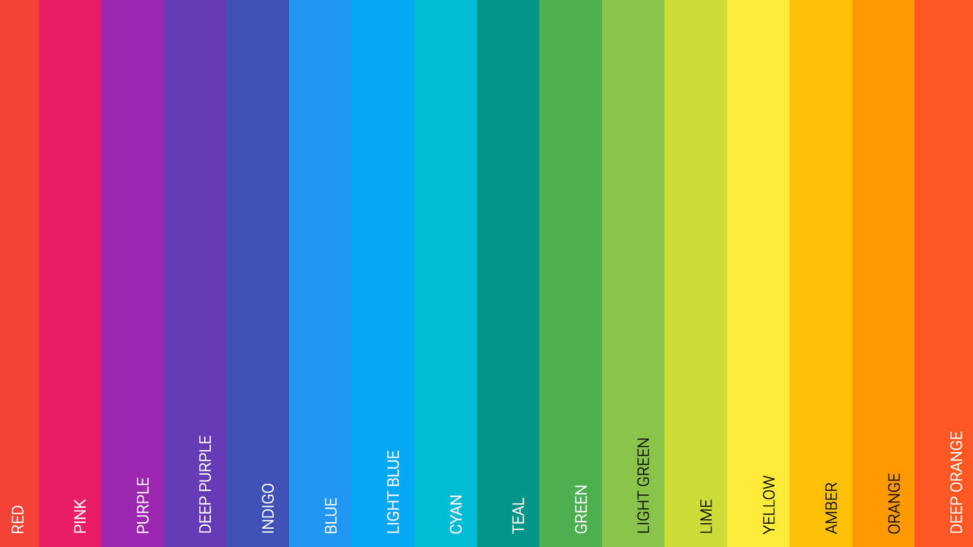
Modern web designers benefit from studying established design systems that have invested significant resources in color research and testing. Google's Material Design 3 provides comprehensive color guidance rooted in extensive usability research, offering not just palettes but entire philosophical frameworks for thinking about color in digital interfaces. Apple's Human Interface Guidelines similarly reflect decades of experience in creating intuitive, accessible color experiences across devices and contexts. Tailwind CSS's default color palette has become something of an industry standard, offering a carefully calibrated spectrum of hues at multiple brightness levels that work well together in countless combinations.
Beyond formal design systems, competitive analysis and trend observation provide valuable context for color decisions. Examining what's working within a specific industry reveals both conventions that establish user expectations and opportunities for differentiation. A financial services website that uses bright orange instead of the expected blue makes a statement about being different, but it must balance that distinctiveness with maintaining enough familiarity to inspire trust. Similarly, watching broader design trends through platforms like Dribbble, Awwwards, or Behance helps designers understand the current aesthetic zeitgeist without being enslaved to it.
The most sophisticated approach combines all these references with a clear understanding of brand identity and user needs. A color theme isn't successful because it's trendy or because it follows established patterns, but because it authentically represents the brand while serving users effectively. The best designers use frameworks as starting points rather than formulas, draw inspiration from multiple sources without copying, and ultimately trust their trained eye to recognize when a palette feels right for the specific context and goals of their project.
The Path Forward: Color in an Evolving Medium
As web technology continues to evolve, so too will our approaches to color. Wider color gamuts on modern displays enable richer, more nuanced color reproduction than ever before. CSS features like color-mix and relative color syntax give designers unprecedented programmatic control over color relationships. The growing emphasis on personalization suggests future websites might adapt their color themes to individual user preferences or even ambient conditions.
Yet amid all this change, certain principles remain constant. Color will always serve the dual purposes of creating emotional resonance and enabling functional clarity. The most successful color themes will continue to be those that balance aesthetic ambition with accessibility responsibility, that express brand personality while respecting user needs, and that demonstrate both creative courage and strategic discipline. For web designers willing to invest in understanding color deeply—not just as decoration but as a fundamental language of digital communication—the opportunities to create beautiful, effective, memorable experiences have never been greater.
The art of choosing color themes for modern web design ultimately lies in synthesis: combining technical knowledge with creative intuition, balancing timeless principles with contemporary trends, and serving both business objectives and human needs. Those who master this synthesis don't just make websites that look good; they create digital spaces that feel right, that communicate clearly, and that remain effective and appealing as technologies, trends, and user expectations continue to evolve. In an increasingly visual digital world, that mastery has never been more valuable.
Tags: Opinion
Add comment
- Other Article
- Choosing the Right Framework: A Practical Guide to Best-Practice Problem-Solving Models12 Jul 2026
- Can Science Predict the World Cup? A Look at the Models Behind the 2026 Forecasts04 Jul 2026
- Corruption: A Global Plague, Landmark Cases, and the Path to Prevention27 Jun 2026
- Nations Driving Brilliant Business Ideas and Frameworks in 202620 Jun 2026
- Why the USD Stands Stronger than the IDR — and What Indonesia Can Do13 Jun 2026
- Employee vs. Entrepreneur: Who Bears the Heavier Tax Burden in Indonesia?03 Jun 2026
- The Evolution of Control Operating Centers (COC) in Modern Mining Operations24 May 2026
- Song of: Mariana Istriku13 May 2026
- Organisasi Pensiunan di Indonesia: Dari Komunitas Sosial Menuju Kekuatan Ekonomi Berbasis Pengalaman12 May 2026
- Corporate Risk Management: Why Modern Companies Invest Millions to Prevent Invisible Threats07 May 2026
- The Mining Spirit: A Powerful Mindset for Excellence in the Mining Industry25 Apr 2026
- The Double-Edged Sword: Navigating Competition in the Modern Corporate Landscape22 Apr 2026
- AI Chatbot untuk UMKM: Peluang Besar di Era Digital17 Apr 2026
- AI Chatbots in Business: The Global Revolution09 Apr 2026
- The Heartbeat of Your Business: Why the P&L Statement is Non-Negotiable31 Mar 2026
- Why Your New Business Needs a Financial System on Day One26 Mar 2026
- The Link Between Startup Capital, Business Survival, and the Role of Investor Information21 Mar 2026
- Digital Transformation, Digitalization, and Digitization: Why the Difference Matters More Than You Think14 Mar 2026
- From Business Need to Technology Solution07 Mar 2026
- Bridging the Digital Divide: Starlink and the Future of Internet Access in Indonesia27 Feb 2026
- A Long Weekend Getaway to Yogyakarta16 Feb 2026
- Understanding ERP Systems: A Comprehensive Guide for Modern Businesses16 Feb 2026
- Building a Culture of Awareness: Strategic Approaches to HSE and Information Security Campaigns in Modern Organizations10 Feb 2026
- Building an Effective IT Organization in Coal Mining: A Strategic Framework for Growth02 Feb 2026
- The Art and Science of Color Themes in Modern Web Design17 Jan 2026
- IT Outsourcing vs Internal Resources: A Comprehensive Cost and Risk Analysis05 Jan 2026
- The Hidden Dangers of Mishandled Employee Data: When Internal Tables Fall Into the Wrong Hands05 Jan 2026
- Securing SQL Server: A Complete Guide to Database Access Control05 Jan 2026
- Beyond Human Error: Understanding the Complete Security Chain in Information Security01 Jan 2026